我们都知道,通过margin: 0 auto;,可以很简单的就实现了水平居中,但是我们却不能通过margin: auto;来实现垂直居中。要在各种环境下实现完美居中,还是一件挺烦人的事情,特别对于新人来说。虽然通过google我们可以很方便的找到一种实现方式,但是如果只会使用而不了解其实现原理的话,是非常不利于我们学习的。下面我们就来一一探索常见的6种实现方式的奥秘。
首先,我们先来整体对比下6中实现方式
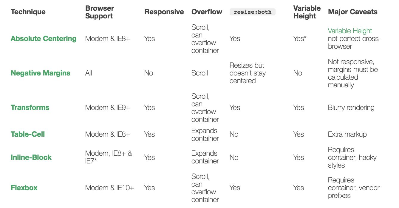
Absolute-Center
1 | .Absolute-Center { |
下面分析这种方式的内容原理
在普通的内容流中,margin: auto;的效果相当于top和bottom均为0,也即margin-top或者margin-bottom 设为auto的时候,它们的值其实就是0。
W3.org: If ‘margin-top’, or ‘margin-bottom’ are ‘auto’, their used value is 0.
当设置position: absolute;,离开了普通的内容流之后,就不一样了。
对于绝对布局的元素,它的top, right, bottom, and left属性,是用来指定与外部容器(相对布局的父元素或者body)边缘的偏移值。当元素的高度和宽度已知,则浏览器会将margin-top和margin-bottom设置成一样,因此元素就居中了。
优势
- 浏览器兼容性
- 不需要增加额外的元素来布局
不足
- 需要指定高度(可以使用百分比%属性来部分支持可变的高度)
Negative Margins
如果我们事先能够确认元素的大小,并且元素的大小是固定的,那我们只需要设置元素的top和left均等于父元素的50%,然后设置margin-top和margin-left为元素高度和宽度的负一半就可以实现居中:
1 | { |
原理
设置left和right将元素的左上角放置在容器中心,然后设置margin-left和margin-top等于元素宽度和高度的50%,便可以将元素的中心移到容器的中心。
优势
- 只需要少量代码就可实现
- 浏览器兼容性好
不足
- 不支持可变的高度
- 需要手动计算偏移值
Transforms
实现方式与Negative Margins方式非常相似,只是通过transform来实现偏移
1 | { |
原理
使用transform来控制元素的偏移
优势
- 支持可变的高度
- 少量代码就可实现
劣势
- IE8及以下不支持
- 需要添加浏览器引擎前缀
- 因为设置了transform,可能会影响到其他转换
- 一些情况下,边缘或者文字会变得模糊
Table-Cell
Table-Cell这种方式应该是最简单粗暴的方法了
1 | <table style="width: 100%;"> |
由于现在我们会非常关注语言,所有如果要增强语义的话,我们可以用class来替代,然后在css文件中将容器的display为table,子元素的display为table-cell便可
1 | <div class="something-semantic"> |
1 | .something-semantic { |
优势
- 实现简单,容易理解
不足
- 语义不够明确
- 需要增加额外元素
Inline-Block
1 | <div class="Center-Container"> |
1 | .Center-Container { |
原理
1)当元素设置了text-align:center;,那么其内部text元素都会水平居中,这些元素包括inline-block的元素;
2)通过使用伪类after,并且设置了height: 100%;和vertical-align: middle;,这样所有与它垂直对齐的元素都会与它中心对齐,也即在容器中垂直居中。
优势
- 支持可变高度的内容
- 浏览器兼容性好,能够直接IE7
不足
- 需要增加额外元素
- 不是很好理解
- 依赖于
margin-left: -0.25em;来实现水平居中,对于不同的字体,可能需要进行微调。 - 放置内容的容器的大小必须不能超过外部容器的宽度减去0.25em
FlexBox
Flexible Box,简称Flex,意为”弹性布局”,用来为盒状模型提供最大的灵活性。这里不过多介绍Flex,希望了解更多的同学,可以参考这篇博客A Complete Guide to Flexbos
1 | .Center-Container { |
优势
- 支持任意宽度或高度的内容
- 更为灵活的布局方式
不足
- IE8-9不支持
- 需要外部容器或者修改body的样式
- 需要添加浏览器引擎前缀